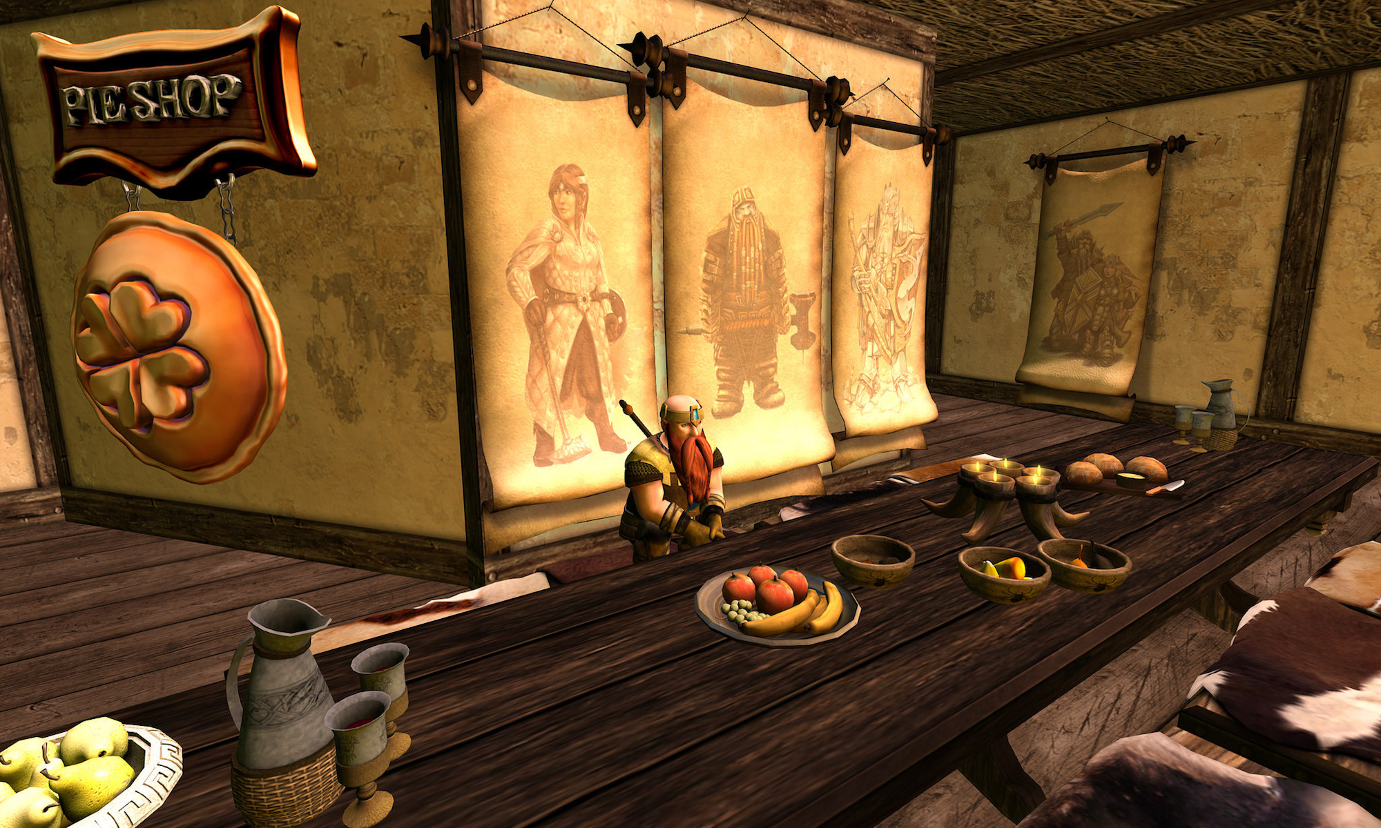
I’m not a fashionista, I’ll never be a fashionista, so I’m not going to post about fashion. I don’t generally post about shopping either. However this evening I happened to find myself at Slink. Now Slink are famous for their mesh hands and feet. I’ve never shook a mesh hand or kissed a mesh foot, I’m way behind the times with things like this and I’d be doing Siddean Munro a great disservice if I tried to talk about Slink’s products.
However what I can talk about is the design of the sims, which totally took me by surprise because they’re both pleasing on the eye and the graphics card.
Shopping experiences are often not much fun due to the fact that they can be busy and people pack a lot into small spaces. Not so with Slink which makes good use of the space as well as making good use of not making all textures and buildings in your line of sight. Whether this is on purpose or not I don’t know, but it definitely works well. Some buildings are down alleys, others are in a nice open square but the fact that some textures are out of line of sight is a good design technique.
There are two sims here, Slink general and Slink West. There is a bridge between the two stores and a handy sim crossing notice. This is particularly useful as both sims are on different server release channels so this helps to explain why you suddenly get a message about the region you are entering being on a different simulator code.
Slink General is home of the main store and Slink West, which is across the bridge is home to other stores. In terms of a view I like Slink West better, although it should be pointed out here that the purpose of these sims isn’t to please my eye, it’s to sell goods and wares. However there’s more to Slink West as it hosts more stores and therefore more buildings.
However what is particularly pleasing about Slink West is that they have a cafe style bar, so if you’re dragged out shopping you can sit down for a rest and maybe tell the other person you’re with to get on with whilst you relax.
I admit to being pleasantly surprised at how nicely designed these sims are, alas I really can’t comment on their products but judging by the number of people arriving and leaving the sim, they must be doing something very right.
SLURL to Slink : http://maps.secondlife.com/secondlife/Slink/15/123/24


Siddean actually got many things right. First of all, her own products (shoes, clothing) are really nice. Second, her avatar enhancement hands and feet are exceptional; and the Slink Physique body is particularly good and I’m looking forward to see what the updated versions will be like. Third, she offers great customer service. Fourth, she neatly provides a place for vendors who make third-party accessories for her hands and feet, right next to her shop, thus benefitting both her own business and the other content creators who have adopted her system. And, as an added bonus, her store looks great. I can think of many shops in SL that could learn a few things from her.
I was really surprised about how pleasant an experience those sims were. I can’t really comment on her content but it’s good to see a designer who has their head screwed on about forming alliances with other merchants too.